
Rebrand, Visual Language & Website Relaunch for Simplesense
A full rebrand and relaunch that make complex data infrastructure instantly understandable.
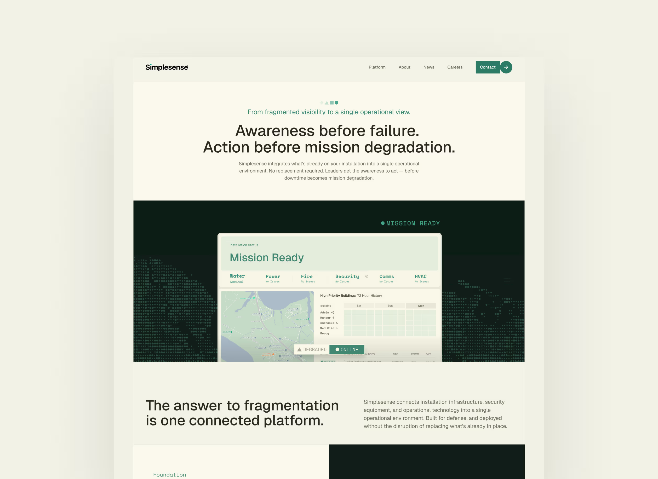
Simplesense connects systems that don't talk to each other, and their old site shared the category's problem: complexity nobody could parse quickly. We rebuilt the brand from the ground up, turned that core story into a visual language that carries through the platform, and relaunched the website. The same system has since extended into their case studies and whitepapers.
In partnership with TRU VM and Marie Wilda.
“They rapidly got up to speed on our problem and solution set and cut through the complexity to create a design that cleanly tells our story to an outside audience.”

The brief
Out of the defense-tech corner
Simplesense gives the people who run military installations one view of the infrastructure underneath their mission: power, water, security, communications, all of it on separate, aging systems that were never built to talk to each other. The category they sell into has a look. Dark mode, full-screen video, threat language, technology first. Simplesense wanted a white, quiet site that makes a complex product simple to grasp, and a company that is visibly about people. Their own line for it is Mission First, People Always.
The messaging strategy came from Marie Wilda and runs on one thread: visibility enables awareness, awareness enables action, action reduces downtime. Simplesense had reached us through TRU VM, a marketing agency we have worked with since our early days. Our part was the brand, the visual language and the website itself.
The process
Building on research that already existed
Simplesense came in with the research done. They had interviewed their customers, written a white paper on the problem and worked out positioning and messaging with Marie. Repeating that work would have cost weeks and told us little new, so we built on it. The first step was an async design exercise: the team annotated a set of reference sites with stickers and comments and named the associations they wanted to own and the ones they wanted to avoid.
Then we went into a workshop with Simplesense's leadership, Marie and TRU VM, traded ideas and challenged them, and came out with a short list of priorities. Order from chaos, above everything. Make it obvious within seconds what the product does and which problems it solves, because a site that feels clever and explains nothing was the failure they feared most. Show that the product is operational and ready to scale, on a site that reads as a software company and never as a consultancy. And keep the people in it: the dispatchers, facility operators and commanders the product exists for. We also settled who the site is for: one buyer, the leaders of installations and their supporting infrastructure, with other markets deliberately left for later.
From there the work ran in iterations. Explorations, applied to real pages, checked in async, narrowed each round. Each round went back to the team as a single direction built on what the workshop had produced, and the only question was whether it was right yet. It got closer every round.
The constraint
Why the simple design is the harder one
A rich design is forgiving. Gradients, shadows, patterns and background effects carry a lot of weight, and they hide a lot too. Take them away and three things are left: typography, a strong form language and the visuals. Typography could only do so much here. The copy is long and editorial, so the oversized display type that makes minimal sites look striking was off the table. The audience has no patience for a design that shows off, so restraint was a requirement. And the background stayed white, because dark mode is the category default.
So the time that would normally go into effects went into two things. The product itself, with the dashboard high on the page as the clearest possible answer to what Simplesense does. And the visual language, which carries the how.
The dashboards
The product, redesigned from the ground up
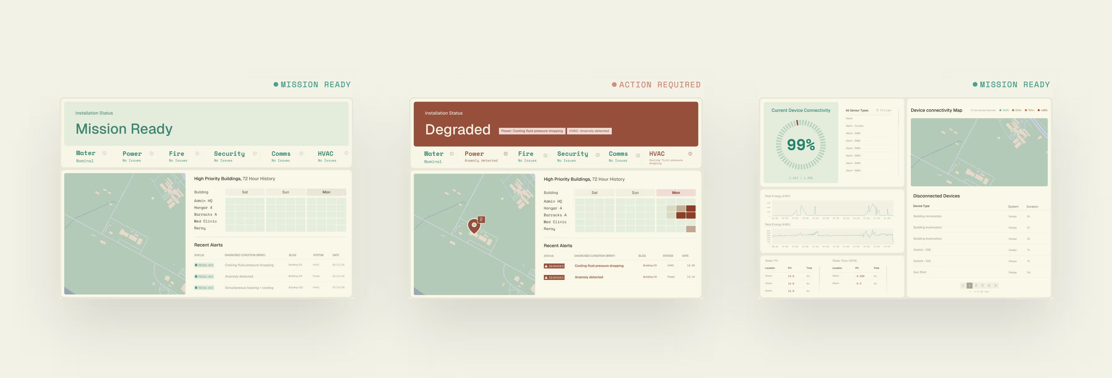
The dashboard is the clearest answer to what Simplesense does, so it had to look like the brand. We redesigned it from the ground up: an operator view and a command view, on the same white ground and with the same restraint as the site. Color does the work. Green means mission ready, terracotta means degraded and action required, and every element on the screen reads that state at a glance.
The task was to set the visual direction. Simplesense's team builds the detailed dashboards, closer to real use, on that foundation, and they match the site in style and look without depending on us.
Clean visuals are a core part of how we work. Going deep once, into a proper source of truth for the product, makes every visual that follows better and faster, on the website and in everything that comes after it.
The visual language
Three shapes that cannot talk to each other
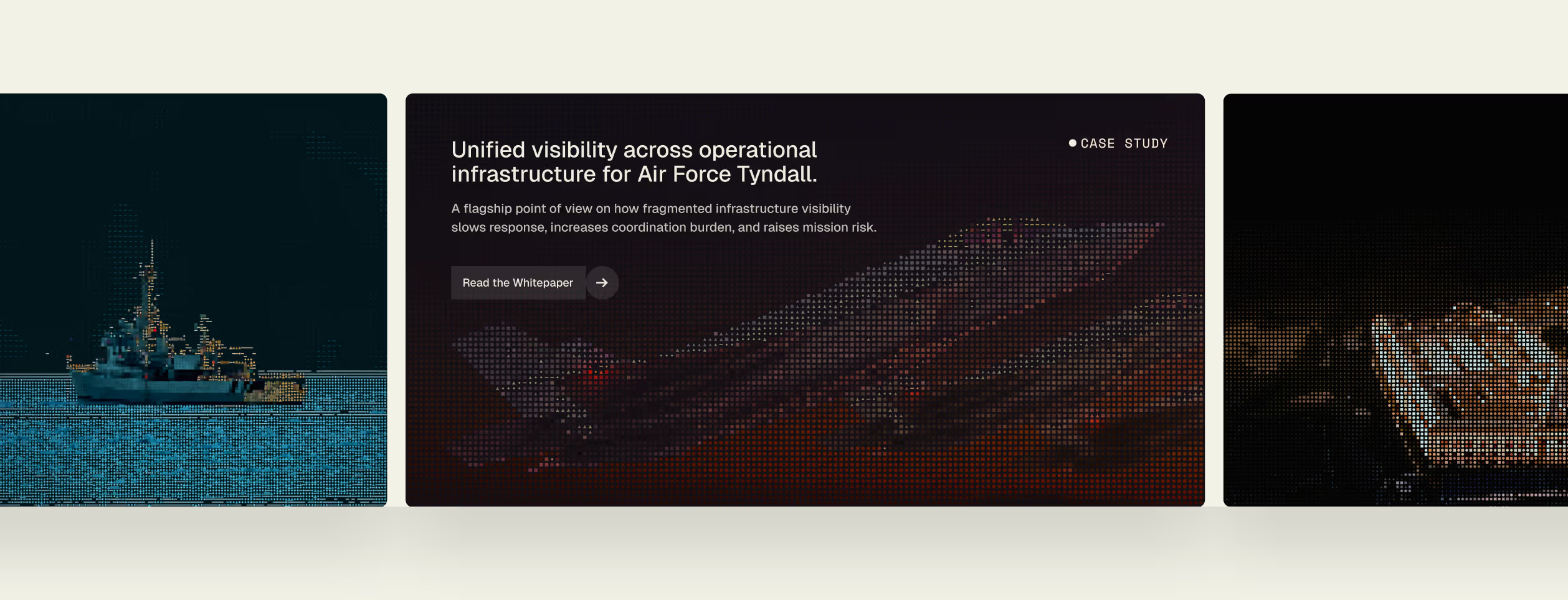
Simplesense connects systems in infrastructure that were never built to communicate. That became the whole language. Every visual starts from three forms, a square, a triangle and a circle, standing in for the systems and the people that have to work together on an installation: leaders, incident response, facility operators. The circle is the green dot from the Simplesense logo, the one element of the old brand everyone wanted to keep. At the start of each visual the shapes sit apart. Then they connect, and the picture comes together. That movement, from scattered forms to one clear image, is the Simplesense effect, and it is the sentence the brand runs on: turn complexity into clarity.
The rules are deliberately loose. A tighter system would have limited what the images can do. What we cared about is that every visual, on every page, tells the same story.
The imagery
Accurate, good-looking, or abstract
Imagery is a familiar problem in the defense and infrastructure space. Pictures have to be accurate, because the audience lives in these facilities and spots a wrong detail immediately. They also have to look good, and real infrastructure is cables, racks and clutter. Photos of actual users are off limits in this world, and stock photography was ruled out early. Sites in the category tend to settle for accurate and pay for it with pages that look like a server room. We went abstract. An image built from the three shapes no longer has to document a real installation, so it can be composed and iterated until it carries the message. It also gives the brand room to be more creative and to stand out in a category where everything looks the same.
The people came back in through words: the roles the product serves, named on the page, and written quotes where a photo would have been impossible. The client loved it, and from that point the rest of the project moved quickly. The same shapes have since carried into their case studies and whitepapers.